
Share
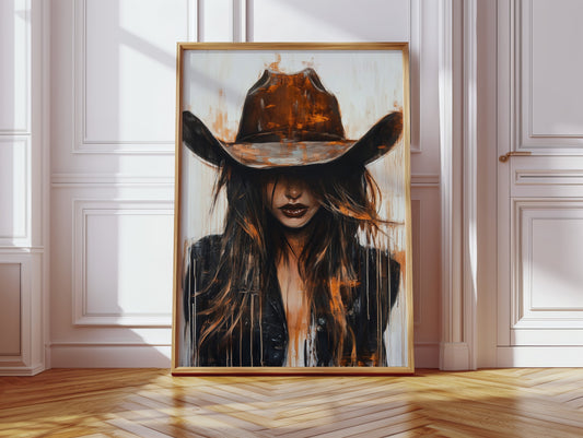
Learn how to mix art styles confidently with designer tips on color, placement, and framing. Create a curated gallery wall that reflects your unique style.
| Product Image |
|---|
| Product Title |
| Price |
| Type |
| Vendor |
| Collections |
| Tags |
| Short Description |


Tour 12 of the world's greatest golf courses — from Augusta to St Andrews — and the wall art that...
Tour 12 of the world's greatest golf courses — from Augusta to St Andrews — and the wall art that...

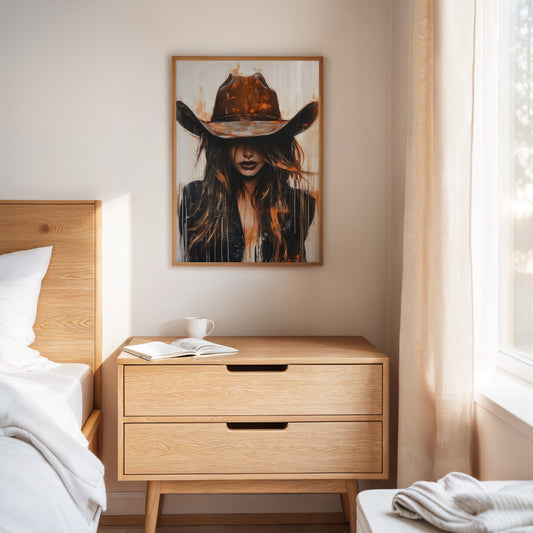
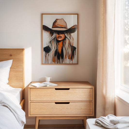
Skip the over-bed clíchés. Discover intentional, design-forward bedroom wall art — plus the exact sizing rules — to build a...
Skip the over-bed clíchés. Discover intentional, design-forward bedroom wall art — plus the exact sizing rules — to build a...

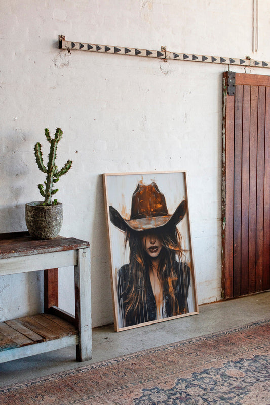
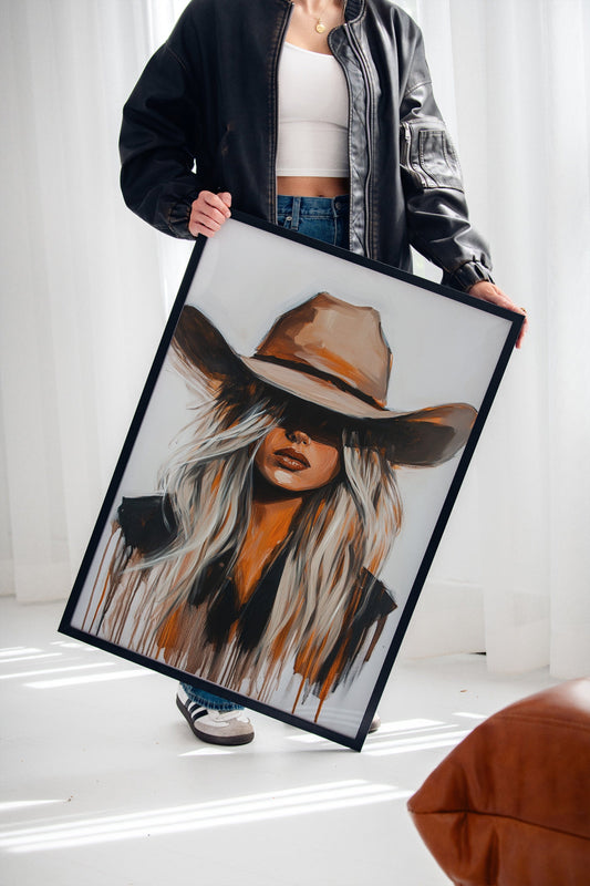
Skip the forgettable candle. Wall art housewarming gift ideas that suit any new home, ship ready to hang, and never...
Skip the forgettable candle. Wall art housewarming gift ideas that suit any new home, ship ready to hang, and never...
1 comment
very cool blog!! Excellent .. Amazing ..I am happy to find a lot of useful information here in the post, thanks for sharing
The Institute of Science and Techniques of Physical and Sports Activities, University of M’sila.